New vs Old vs New Again
I know that sex sells but please, not in my coffee.
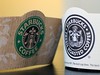
So I thought this was a new logo but I now see that this brown logo is actually the company's old logo. Now I don't mind the breasts but the fin spread is, well, a little too...inviting.
And to be honest, you know the mermaid isn't happy that her thighs look that big.
Check out How the Starbucks Siren Became Less Naughty and Starbucks Logo for a couple interesting articles on the evolution of the Starbuck logo.


No comments:
Post a Comment